OVERVIEW
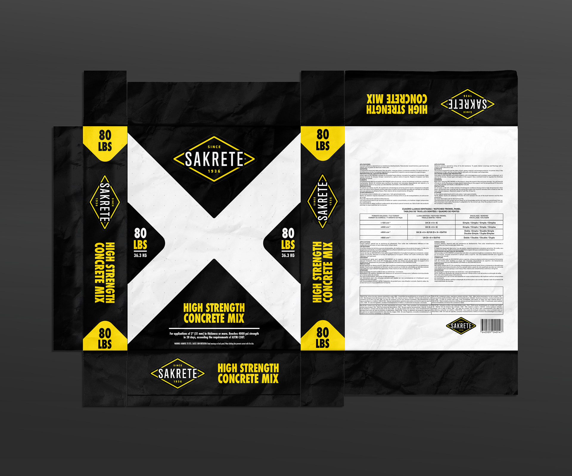
This project is a speculative redesign of the Sakrete brand's product packaging, a leading manufacturer of concrete and masonry mixes. The objective was to modernize the brand's visual identity and improve the user experience at the retail level. This case study demonstrates my ability to conduct competitive analysis, develop a scalable design system, and deliver a cohesive brand experience that aligns with the "Live Well Outside" mission of Oldcastle APG.
THE CHALLENGE
Sakrete has a long-standing reputation for quality, but the current packaging presents an opportunity for improvement in a competitive retail environment.
- IMPROVE SCANNABILITY: Make it faster and easier for customers—from DIY enthusiasts to professionals—to identify the right product at a glance from a distance on a store shelf.
- ENHANCE VISUALS: Modernize the overall aesthetic to reflect the quality of the product and stand out against competitors in a cluttered aisle.
- CLARIFY INFORMATION: Reorganize the visual hierarchy to make key information, such as product type, strength, and usage instructions, immediately accessible without extensive reading.
MY APPROACH
- COMPETITIVE ANALYSIS: I began by thoroughly researching the packaging of Sakrete's key competitors. I noted best practices in the industry, such as the use of clear color-coding and durable materials, and identified opportunities to create a more impactful and trustworthy visual presence.
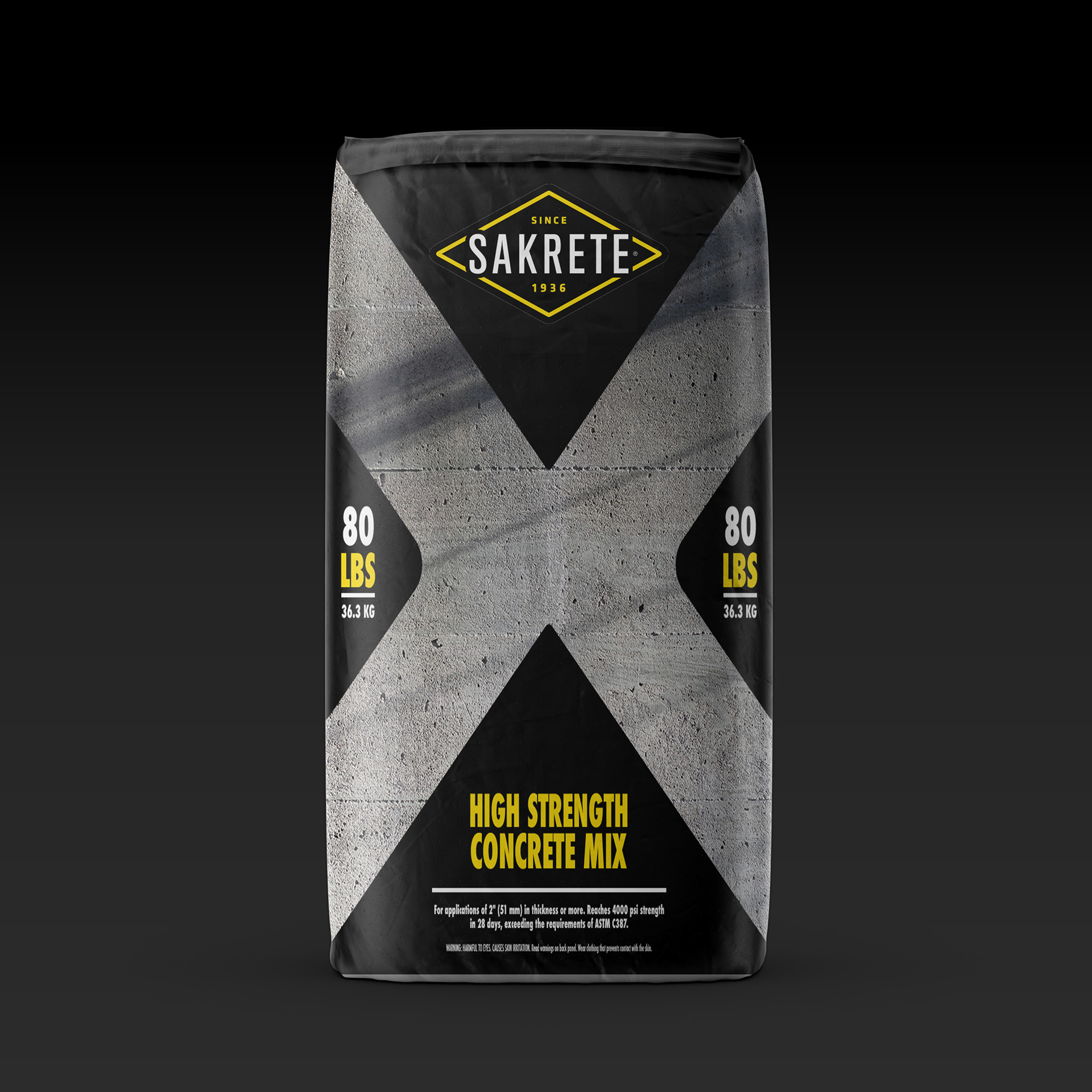
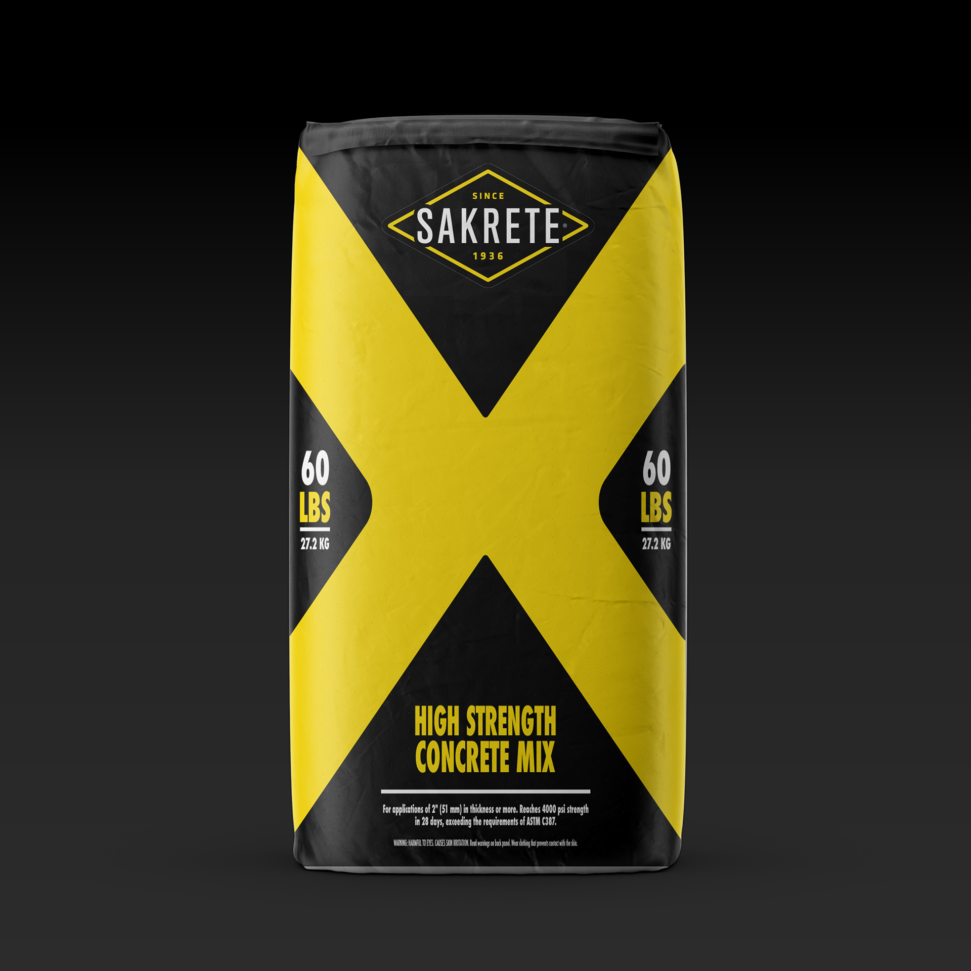
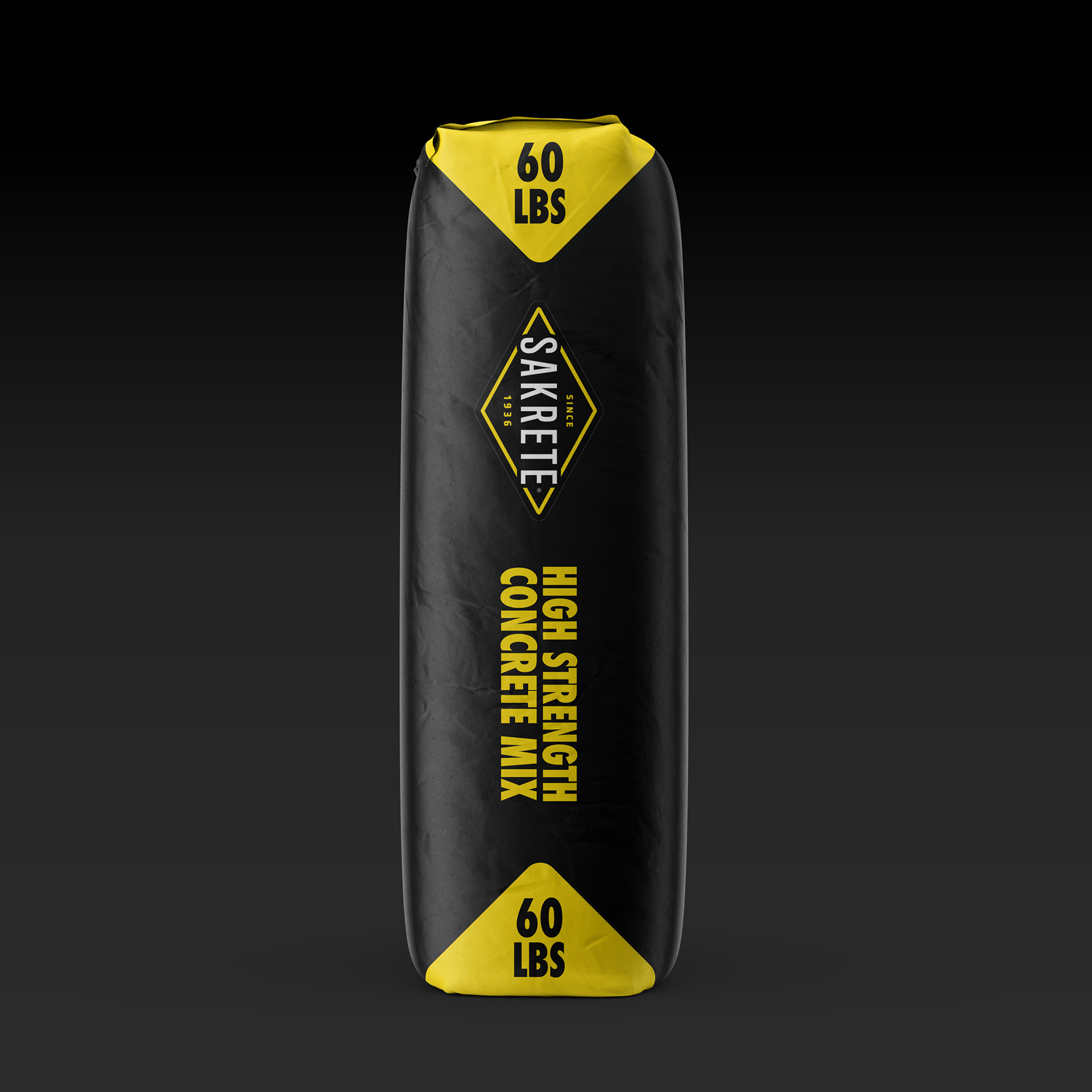
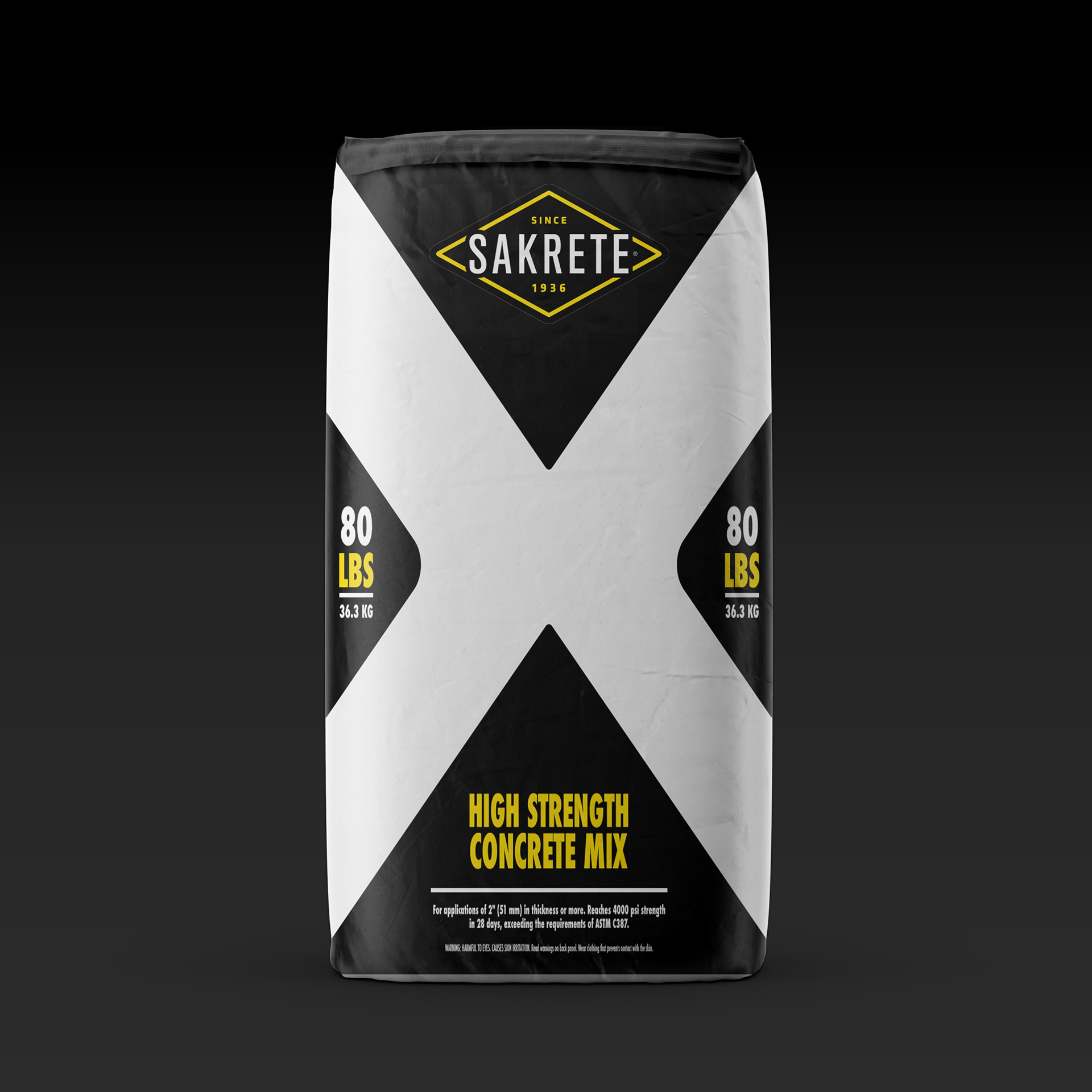
- INFORMATION ARCHITECTURE & VISUAL SYSTEM: I created a new visual system designed for clarity and impact.
- A SIMPLIFIED COLOR PALETTE: A refined palette was chosen to differentiate products while maintaining a consistent, recognizable brand look.
- BOLD TYPOGRAPHY: I selected a strong, modern typeface that is highly legible both up close and from a distance.
- ICONOGRAPHY: I developed a set of simple, intuitive icons to quickly communicate product benefits and applications, helping users make informed decisions without having to read through large blocks of text.
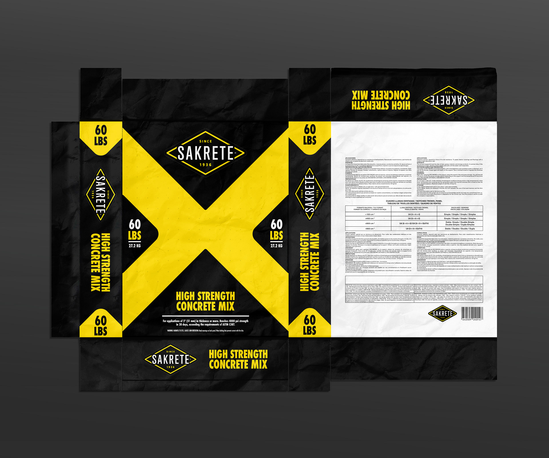
- APPLICATION AND MOCKUPS: I applied the new design system across multiple product mockups to demonstrate its consistency and scalability. The final mockups show how the design would appear on a store shelf, highlighting its ability to command attention and guide the customer's eye effectively in a real-world context.
THE SOLUTION
The proposed design solution for Sakrete packaging is a fresh, modern take that maintains brand recognition while significantly improving the customer experience.
- CLEAR VISUAL HIERARCHY: The redesigned packaging makes it easy for customers to find the information they need, reducing friction and increasing the likelihood of a sale.
- A MODERN AESTHETIC: The updated visual design aligns the brand with the modern consumer and the "Live Well Outside" mission, positioning Sakrete as an innovative leader.
- A SCALABLE SYSTEM: This new system can be consistently applied to all of Sakrete's product lines, strengthening brand loyalty and ensuring a cohesive presence in the market.
This project demonstrates my passion for the building products industry and my ability to create innovative, effective packaging designs that not only look great but also solve real-world problems for both the brand and its customers.